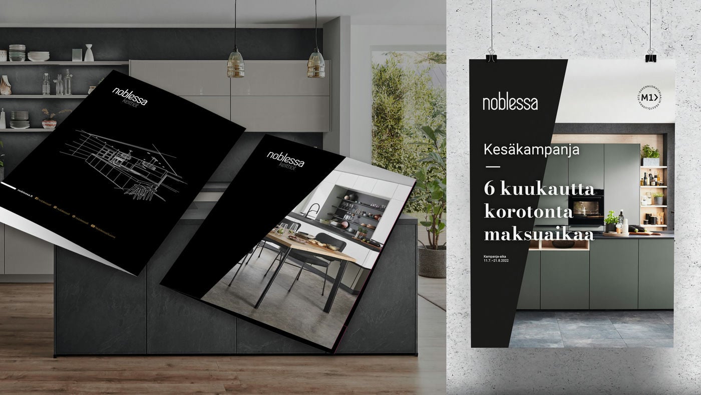
Noblessa
Pitkäaikaisen markkinointikumppanuuden avulla laatukeittiöbrändi on kasvattanut Suomessa tunnettuuttaan ja laajentanut myymäläketjuaan merkittävästi. Brändin jatkuvan kehittämisen lisäksi tuotamme Noblessan markkinointimateriaalit ja markkinointiviestinnän.
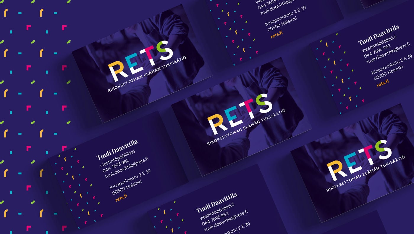
RETS – Rikoksettoman elämän tukisäätiö
Brändiuudistuksen yhteydessä kirkastettiin brändistrategiaa, uudistettiin nimi ja luotiin uusi visuaalinen ilme, jotka yhdessä vahvistavat säätiön asemaa alansa asiantuntijana ja yhteiskunnallisena vaikuttajana.
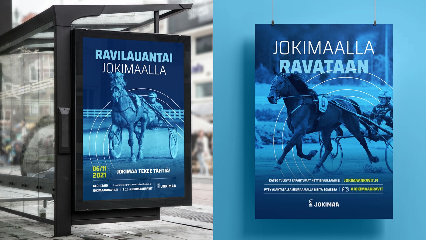
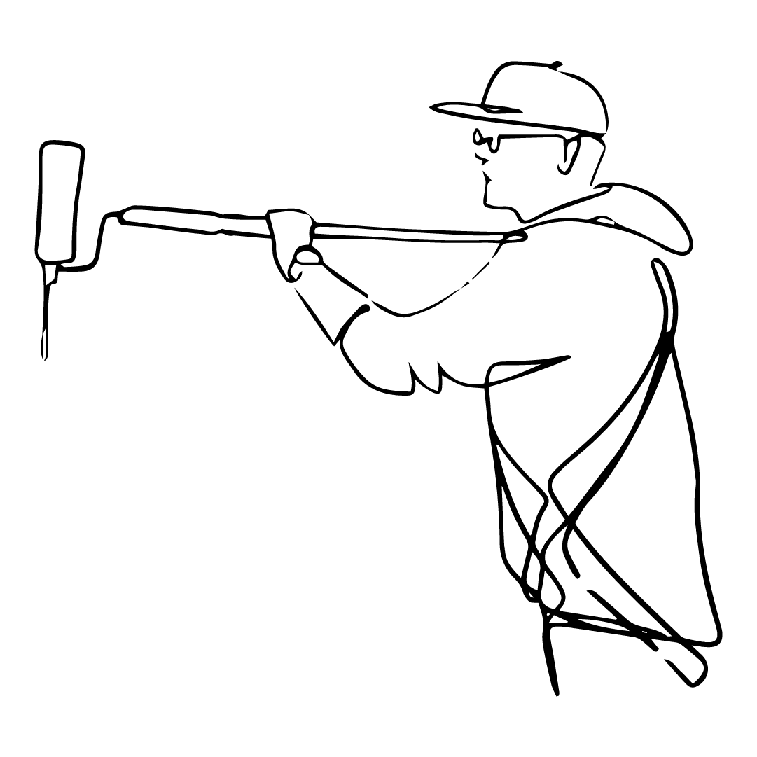
Jokimaan Ravikeskus
Perinteikäs ravirata sai uutta nostetta brändiuudistuksesta, joka tukee Jokimaan tavoitemielikuvaa koko perheen monipuolisena tapahtuma- ja elämyskeskuksena. Brändi-ilmeen lisäksi toteutimme Jokimaalle erottuvat verkkosivut ja mainosmateriaalit.
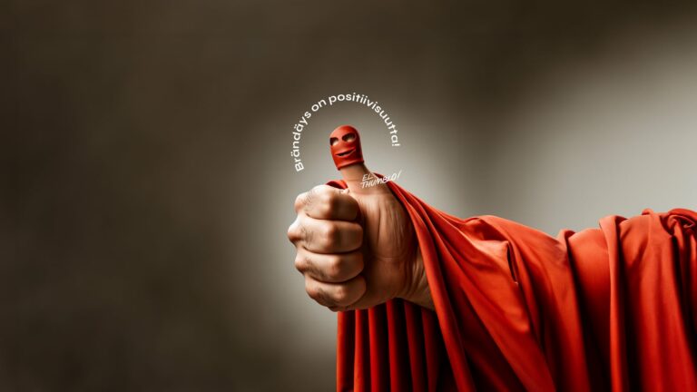
Brändäys on positiivisuutta
Oletko miettinyt, että tässä negatiivisia uutisia suoltavassa maailmassa on yksi positiivisuuden linnake: brändäys. Yrityksen brändin rakentaminen ja kehittäminen ei nimittäin
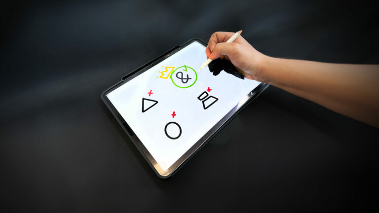
Miten valita sopiva mainostoimisto?
Nappaa talteen neuvot, joiden avulla löydät omaan projektiisi tai liiketoimintaasi sopivimman mainostoimiston kumppaniksi.
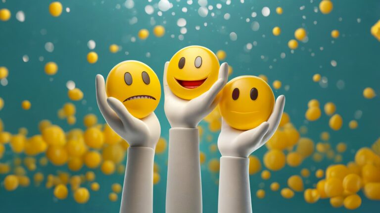
Palautteesta ei saa panttimaksua, mutta se kannattaa silti
Palautteen antaminen on yksi elämän tärkeimmistä taidoista. Negatiivinen palaute on tienviitta tuleville toimenpiteille, ja positiivinen palaute kertoo, mitä kannattaa tehdä